Bookmarks Spotlight: Issue #2
I shared a few last time. In the meantime, I did some cleanup on my bookmarking app and I can proudly say the pile got… Bigger?! Oh, well. Here we go again.
Visual Inspiration
Seventeen Agency
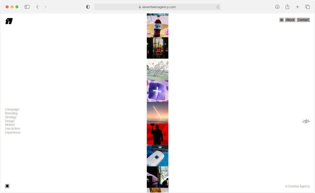
A creative agency describing themselves as… “A creative agency”. And “A collective of Odd Minds bringing new angles underpinned with meaning”. Which, fair enough. Their approach to highlighting category–project relationships as you navigate is nothing short of creative and odd (in a good way).
Clean, considered, and a good reminder that the way you show your work is part of the work.
Fontsssss
Cal Sans
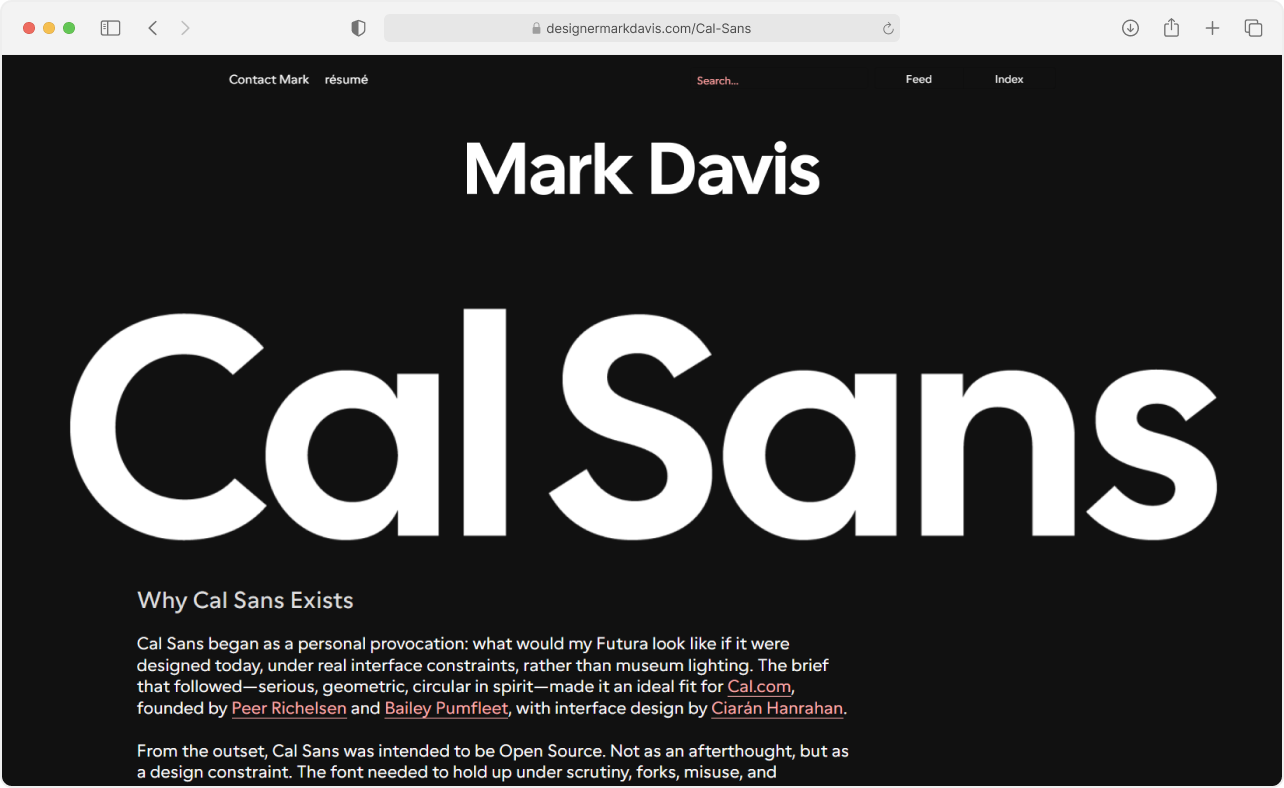
Open-source geometric sans-serif commissioned for Cal.com, designed by Mark Davis. Built for tight display settings — I’m talking reaaal big headlines, baby.
The interesting bit: it ships with multiple kerning philosophies baked into its stylistic sets, letting you decide whether diagonal letterforms should crash into each other or politely stay apart. Probably one of a kind in that regard. Also free, which is nice. Oh, and open-source. Did I mention it’s open-source?
Font size is useless; let’s fix it
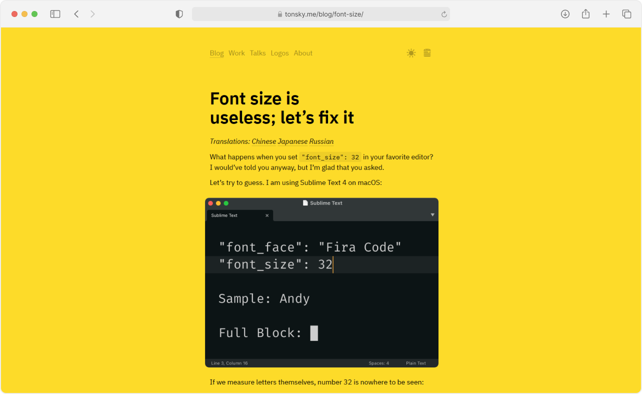
Turns out “font size” means… Some thing. Or another thing. And it depends on the screen, too. Nikita Prokopov walks through why the number you set in Photoshop, Figma, CSS, or your code editor has very little to do with how tall the letters actually end up, and what the gods devs above can do about it.
Reading List
Why You Should Release That Shitty Font
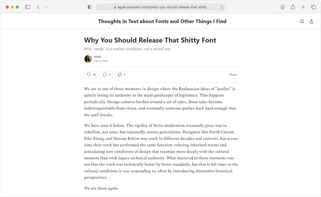
The thing you’ve been sitting on? Yeah, that one.
Maybe this will give you enough courage to do it and release it into the world… Or the world wide web, at least.
Toolbox
Pixa Uncrop
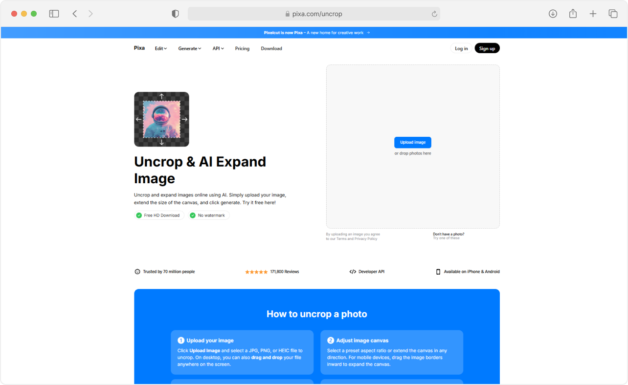
Ex-Pixelcut, AI-powered image extender for when you have a photo that’s cropped a little too tight and you’d rather not open Photoshop about it. Upload, extend, done. And it’s free… With limits. 3 image downloads per day, with a 2000px extension cap.
Schultzschultz TouchType
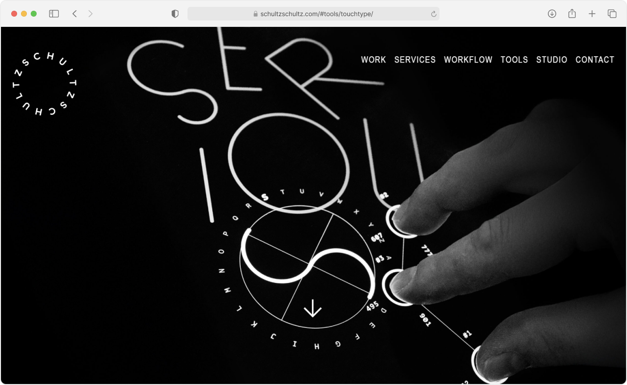
A free multi-touch lettering tool from Frankfurt studio Schultzschultz, made specifically for iOS (of course we can’t have nice things on Android or Windows). Each finger does something different: one tap places a letter, two fingers scale it, three fingers spin the alphabet like a rotary dial. Four fingers? Well, that’s on you to find out.
It’s odd, it’s tactile, and it’s a good five-minute rabbit hole on any lunch break.
Discussions on the Web
Jonathan Hoefler on capital I and lowercase l in Acrobat
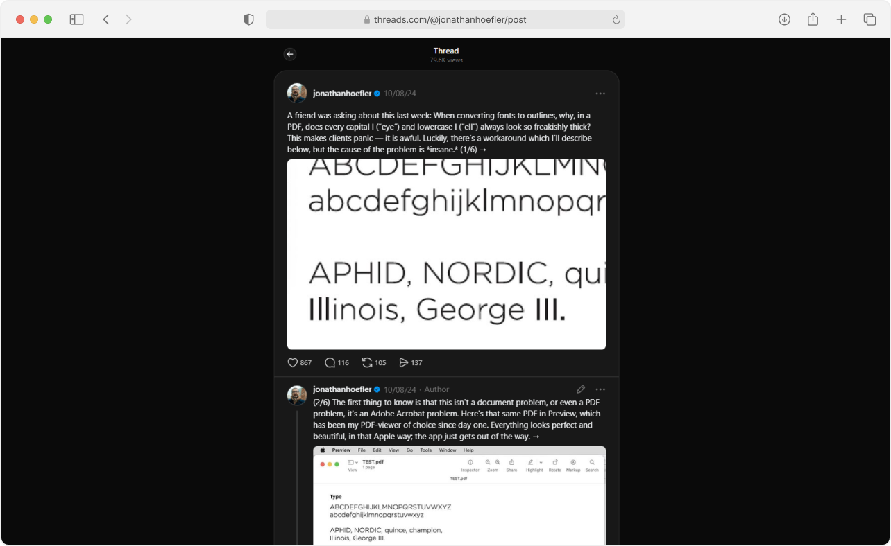
A short, sharp observation from Jonathan Hoefler on how Adobe Acrobat renders capital I (“eye”) and lowercase l (“ell”) significantly thicker than the surrounding letters — an Acrobat-specific issue that Adobe hasn’t fixed, so it’s on you to work around it.
The kind of thing you’ll wish you’d read about when you get hit by it.
That’s it for this spotlight. Skeletor will return next week… Or sometime. See you.